
Home Depot
Enhancing the App for Everyday Users
Overview
Imagine opening an app, hoping to quickly find the right products for a weekend project, only to feel lost in a maze of categories and options. This is where many Home Depot app users—especially non-professionals—find themselves. Home Depot is a leader in home improvement products, and while its app aims to make shopping convenient, it often falls short for occasional DIYers and homeowners.
Problem Statement
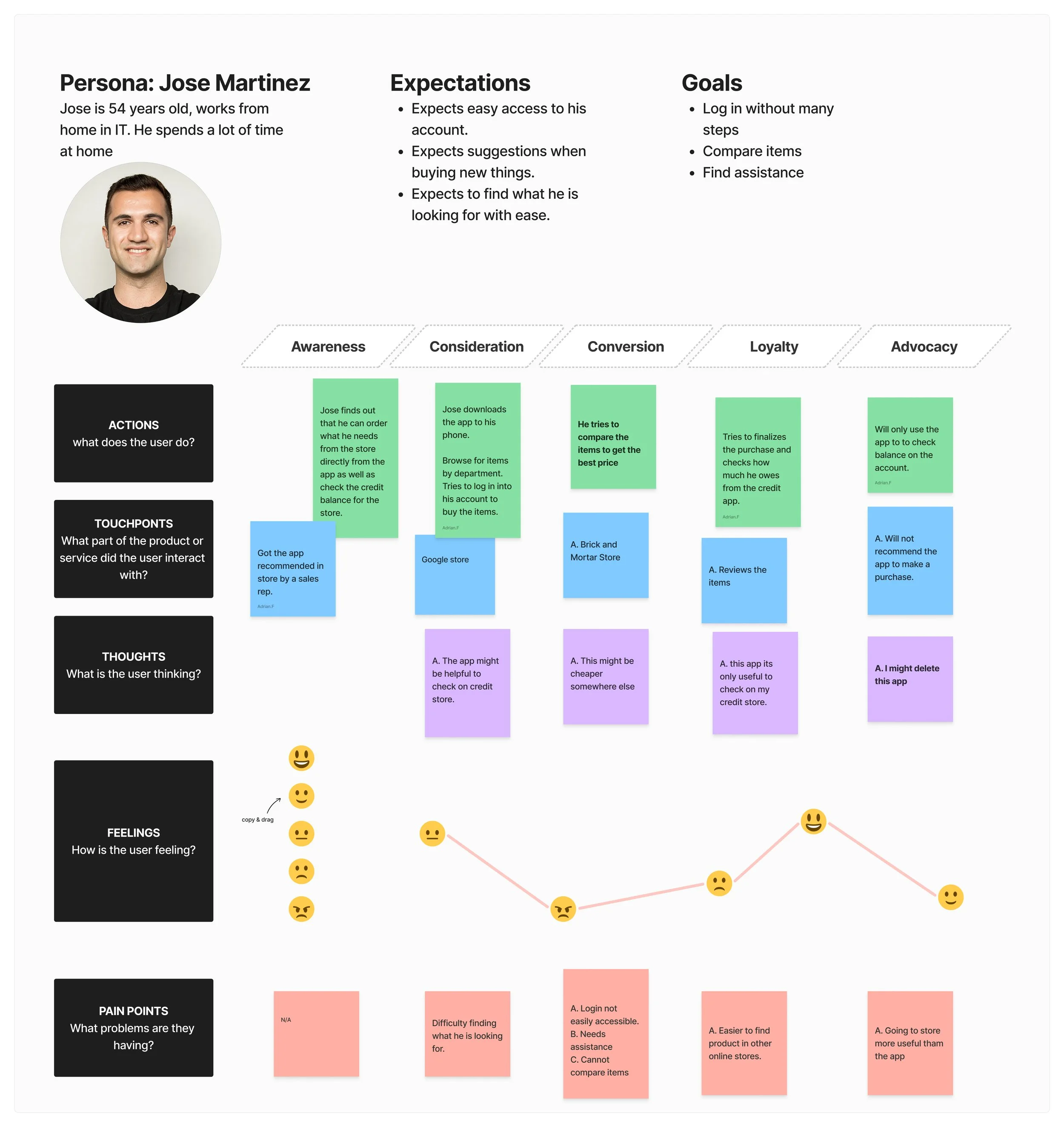
Through my research, I discovered that non-professional customers, those diving into small DIY projects, faced two major challenges in the Home Depot app:
Struggled to locate specific departments quickly
Struggled to compare products while using the “compare feature”


The Users and Their Needs
My research focused on non-professional shoppers (homeowners and casual DIYers) who frequently use the app for small projects around the house. While professionals who are familiar with industry terms and product specifications also rely on the app, non-professional often faces greater challenges navigating product categories and understanding specifications. Because of this, they need a more straightforward experience that helps them find the right products and compare multiple options with ease.
One user I interviewed, Jose, a 54 years old homeowner, described how he felt overwhelmed trying to find the right paint supplies for a simple wall repair. He noted that the long lists of options felt "endless," and he didn’t know where to start.
The Process
Research Method
I conducted moderated user interviews with two occasional Home Depot app users in their homes to observe how they interacted with the app. This approach allowed me to document their frustrations in real-time, such as difficulty finding categories and limited comparison tools.
From these interviews, I extracted key pain points:
Users often navigated to the wrong categories due to unclear labeling.
The category menu was a long alphabetical list, overwhelming users who struggled to locate specific departments quickly.
The compare feature’s two-product limit caused frustration when evaluating multiple items.
The compare feature was limited, allowing only two products to be compared at once, which made it difficult for users to weigh all options and make confident choices.
Design Methodology
To address these issues, I followed a structured design process:
User Flows: I mapped out how users moved through the app with the existing design, identifying obstacles and inefficiencies. Then, I sketched new user flows to create a more intuitive experience.
Wireframes: I created low-fidelity wireframes to test layout changes, focusing on making navigation and comparison tools more user-friendly.
High-Fidelity Screens: I developed high-fidelity screens to showcase the improvements.


Challenges and Iterations
One challenge was ensuring the redesigned category menu didn’t become overly cluttered. Initial testing revealed that adding too many icons confused users. In response, I iterated by grouping related categories under broader headings with visual cues, such as icons and colors, to improve clarity.
Another obstacle was enhancing the compare feature without overwhelming the user interface. I iterated by allowing users to add up to five products in a side-by-side comparison view, with collapsible details for each item.
The Big Idea
My goal was to create an experience that put the user back in control. To do this, I developed two key solutions:
Redesigned Category Section: I transformed the long alphabetical list into a visually engaging layout with images representing each department. This change made it easier for users to identify and navigate to the products they needed without feeling overwhelmed.
Enhanced Compare Feature: I made the compare button more prominent and expanded its functionality, allowing users to select and compare up to five products simultaneously. This empowered users to make well-informed decisions by viewing detailed comparisons side-by-side.


The Outcome
With these updates, the app transformed into a more welcoming, intuitive tool for everyday users. Non-professional shoppers could now:
Navigate categories effortlessly using visually guided menus.
Confidently compare multiple products with the enhanced comparison tool.
User testing revealed a significant improvement in task success rates. For example, users completed navigation tasks 30% faster on average and reported feeling "more confident" in their purchase decisions.


Lessons Learned and Future Recommendations
Empathy Drives Design: Observing users’ struggles firsthand reinforced the importance of designing for their needs, not assumptions.
Iteration Is Key: Testing and refining the design based on user feedback ensured the final product truly addressed their pain points.
Explore navigation updates for seasonal features, such as holiday categories, to further simplify browsing during peak shopping times.
Integrate advanced filtering options to complement the enhanced comparison tool, allowing users to sort products by criteria like price, rating, and availability.